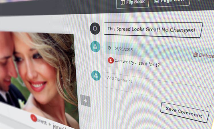
We recently did some usability research on our site and found that users like the fact that they can comment on specific images, leave a general comment for a spread, and see a summary of all comments below the spread.
Our studies also drew our attention to the fact that users are scrolling down to see comments, then back up to see the spread. While not particularly troublesome, in some cases so much scrolling has the potential to interfere with a great proofing experience.
To solve for this, we tested moving the comments to the right of the spread when viewed on bigger screens, and leaving the comments in their current location below the spreads for mobile devices. We worried that the users would be upset that the flip-book presentation is now a bit smaller, but we quickly found that our concern was unjustified, and that users like being able to see comments without scrolling.

We also found that some users expected to be able to edit a comment by clicking on a tag or on an existing comment—so we made that possible too. Now you can see a comment by hovering over a tag and clicking to edit.
As always, we’d love to hear what YOU think. Log in to one of your client albums to see the changes we made and let us know your thoughts!

